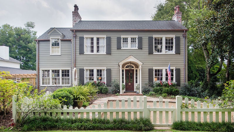
To appreciate a good before and after story, you have to have a full picture of the before. This one starts with a 1960s brick home on Rockhill Road, beloved by its original owners for five decades. But in came new life in 2011 when Jordan and Alex Holt bought the home for their growing young family. In fact, the single ownership was much of their draw to the house, along with the location and schools. (Fun fact: Jordan lived on this street a block away, until age 3 before moving to a home off Mountain Brook Parkway.) It was “super well maintained,” Alex says, noting that the husband, an engineer, had saved appliance manuals back from decades earlier.
Like many homes built in the 1960s, each living area was very separate from the other, with four walls boxing in the formal living room, den, dining room and kitchen. But with the assistance of architect Joe Ellis, the Holts were able to reconfigure the space to be more open and better fit the needs of their family.
It had been five years—and two more daughters later—since move-in day when they hit “play” on updating the home from its original ‘60s style. “We had a lot of time to think about what would work, and I think living in it first was helpful because we knew what we envisioned,” Jordan says. “Being here that long, we were making our list of things [we wanted to do|.”
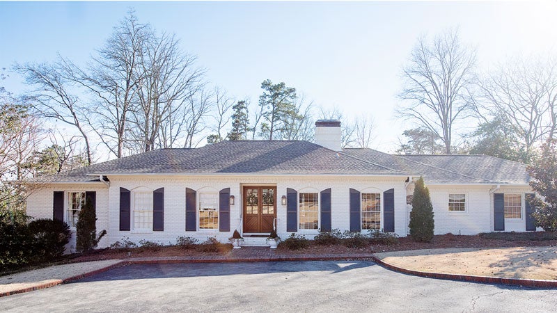 So what did that look like? They knocked down the wall between the kitchen and the den, opening up the flow there, and added archway openings between the den and the now dining room. The laundry room had been in a closet off the kitchen and offered little space, so they took the previous dining room space and converted it into three hardworking spaces: a spacious laundry room, a mudroom at the entryway, and a large, elegant butler’s pantry. What had been an underused formal living room became the new dining room just off the butler’s pantry. The carport is now a garage, and outside, they painted the original red brick white, painted the shutters a dark navy and added new custom-built doors and lighting—all giving it a fresh, new feel.
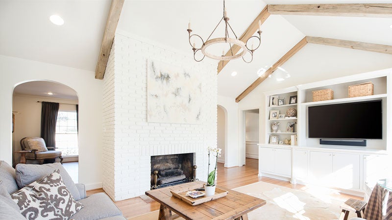
In the living room, they raised the ceilings and added pitch with white oak beams lining them, making the overall space more open and airy in a way that felt original to the house. They also got rid of the paneled walls and put sheet rock in their place.
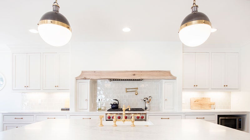
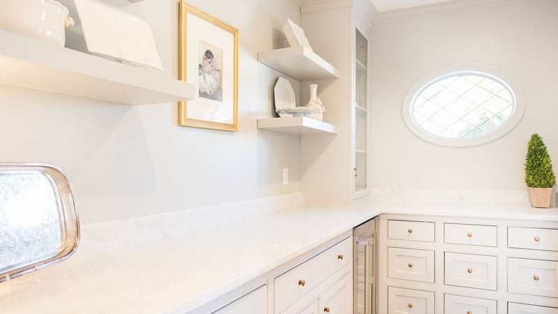
And it wasn’t without character. Jordan worked with interior designer Caitie Morgan, who came recommended by a friend. “I had seen some of her stuff and it was exactly my taste,” Jordan says. “I like the colors she uses—they are very light and airy. I like creams and grays and golds. She’s just so fun and easy to work with.” Caitie found Jordan had a design aesthetic that was a mixture of old and new and worked to come up with ways to implement it in a modern way to make their home more functional. From there Caitie brought in signature design details, including the statement-making range hood in the kitchen and two leaded glass oval windows, one in breakfast room and one in butler’s pantry.
Jordan also likes that now their rooms show off her favorite photos, frames and display cabinets in a fresh way. “Our pictures and artwork are better displayed,” she says. “We get to enjoy it more.”
More than anything, though, the renovation has created more rich family time for the Holt five—including girls now ages 8, 6 and 4. Often before Jordan or Alex would be in the kitchen cooking or doing dishes facing the wall, and their kids were playing in their rooms. But not today. “I feel like we are together more, which I have loved,” Jordan says. “It seems like it’s the way it should have always been.”
 Living Room
Previously a small red brick fireplace became the room’s focal point when they bricked all three sides around it and painted it all white. It now showcases a painting by Wellon Bridgers, a friend of Jordan’s, more prominently than it had before the renovation. The living room also has a new set of built-in bookcases on the wall facing the kitchen that have a similar modern look to their other cabinets.
 Kitchen
Caitie designed the kitchen to have a casual elegant yet comfortable feel, one that was at once child friendly and really pretty. “They love to cook, so I wanted it to feel like a special thing for them,” she says. The kitchen’s statement maker is its built-in hood with a lightly stained white oak accent beam. But the biggest dream come true for the Holts is the marble island with three stools for their three girls, perfect for snack time or coloring while their mom or dad do dishes. The brass faucet and pot filler along with the grey square backsplash tile round out the style of the space.

KITCHEN: BEFORE
Butler’s Pantry
Caitie describes this space as a “nook pocket surprise walking from the dining room into the kitchen.” Open shelving and glass-front cabinets allow the Holts to show off their entertaining piece and glassware, and beneath those Caitie designed plenty of cabinet storage space, along with an ice machine and fridge they use for their kids’ drinks.
 Dining Room
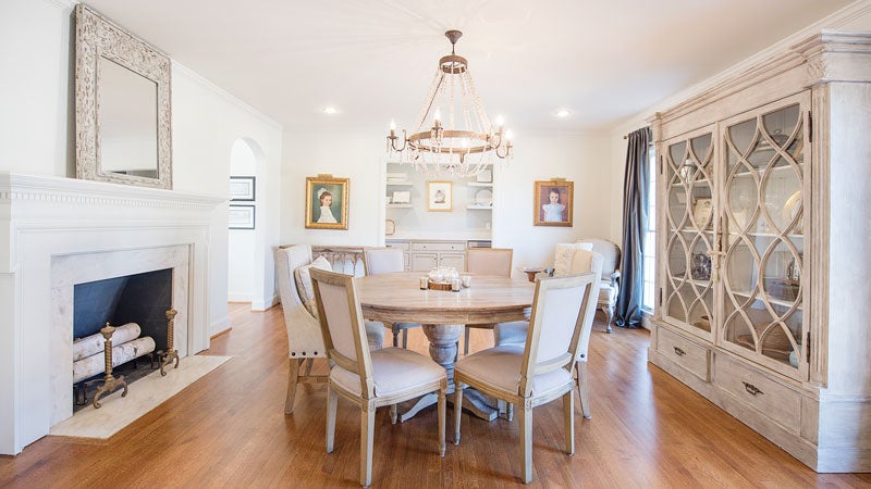
Previously a formal living room that got little use, the spacious now-dining room boasts an ornamental fireplace that was there before the renovations. They simply moved their chandelier and furniture from one room to the next, and new archway openings allow for easy flow from this space to the living room on the other side of the fireplace. The room also shows off the Holt daughters’ portraits by Nashville artist Mary Flora through Portraits Inc. as well as Alex’s grandmother’s chest.
 Laundry Room
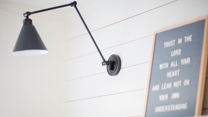
After years without a separate laundry room, this space is easily Jordan’s favorite part of the renovation, with a farmhouse sink and shiplap walls to boot. Shiplap carries over from the laundry room just off the mudroom into this convenient storage spot. Jordan loves having a place for their girls to put their backpacks and bags when they get home.
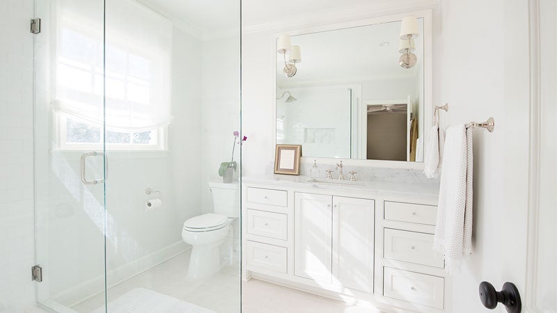 Master Bathroom
What was once a dark space with a bathtub/shower with a green patterned curtain became light and airy with marble and cabinets to match the others in the main living spaces of the house.
Behind the Scenes
- Architect: Joe Ellis, Dwelling Architecture
- Interior Design: Caitie Morgan
- Contractor: Slate Barganier Building
- Cabinets: Deep Fried Southern Cabinetry
- Audio Visual: Steve Key, Home Theater Visions
- Appliances: Ferguson
- Tile: Fixtures & Finishes
- Cabinet Hardware: Brandino Brass
- Exterior Lighting: Bevolo
- Select Art: Wellon Bridgers

