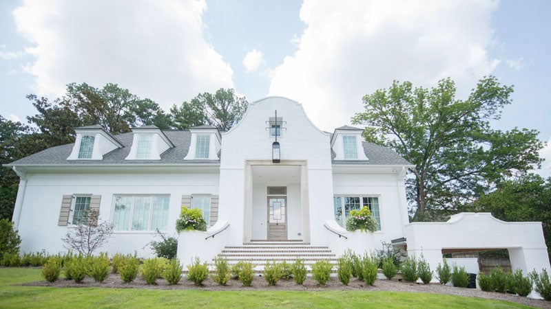
Open the colossal custom-stained door of the Clay home with its centered push/pull knob, and the open floor plan pops with decorative details: bold art wallpaper in the powder room, a silver-and-gold tile patterned bar backsplash and art deco accents on the dining room ceiling.
The wow factor comes in the arches above the door frames. It’s in the crisscross woodwork pattern above the fireplace and echoed in vertical wall that lines the two-story staircase. It’s in the 10-foot-high entryway and 12-foot-high living room, and in the beams in the vaulted ceiling of the kitchen. “Details can make an ordinary house special,” Heather Clay says. “You don’t really need anything else.” Heather had wanted her new home to be something different, something that didn’t look like anything else. And that’s what she got.
Heather and interior designer Lisa Flake—a friend of Heather’s from college—both love color, as is evident in the pops that complement the white and grey palette of many rooms. But Heather says Lisa stretches her outside her comfort zone too. The custom quality of the house carries over to the grey color they mixed for their hardwood floor stain, complete with hints of ebony and white. “It’s different,” Heather says. “People notice it.”
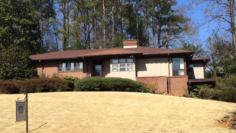
The home previously on the Clays’ property
The Clays had been living in a five-bedroom house on Cherry Street in Crestline they had redone, but they wanted a different space for their kids’ teen years and beyond that was still in walking distance of Crestline Village. They found a ranch with an unusually deep wooded lot that appealed to them and decided to tear it down to start fresh in its footprint. The new house has a third story and is extended 12 feet out the back of where the ranch stood. The new home is 5,671 square feet, whereas the old was only 3,000.
Knowing they wanted an open floor plan and a brick exterior, Heather and her husband, Carter, sketched out their ideas on a napkin at Billy’s one night, and from there residential designer Eric Dale dreamed up countless custom details to make statement after statement as you walk through the home. The result is nothing short of stunning to friends who come over, while also creating a comfortable family space for years to come.
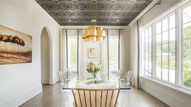 Dining Room
A light black, silver and gold art deco wallpaper (Metropolis Marrasite by Mokum) on the ceiling adds a dramatic touch to this space along with the statement gold chandelier. “I love to put paper on the ceilings because it’s never overkill but packs a big punch,” Lisa says. A portrait of the Clays’ son Coleman by Liz Lindström hangs between the windows.
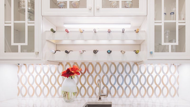 Bar
Bar
The bar’s wow factor comes in the chrome, gold and white marble-patterned backsplash that is made from tile with a seamless grouting job. It ties to the color scheme of art by Cecily Hill Lowe framed with gold and silver around the corner in the kitchen. Both Heather and Cecily are from Meridian, Mississippi, and now live in Birmingham—adding another layer of connection for Heather. Back in the bar, the geometric cabinet door design echoes the front door, and polished nickel cabinet pulls tie the look together.
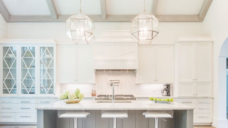 Kitchen
Heather wanted a spacious kitchen with a large island for people to gather (and cook of course), and its vaulted ceiling makes it feel all the more roomy. The polished Vail Select quartzite countertops provide the look of marble used in the rest of the house but with the durability of granite. Plus, its tints of green in horizontal and vertical veins make it one of Lisa’s favorite stones. Beneath it, a grey island provides an accent to the mostly white space. The triangular pattern used in the architectural details is echoed in a section of built-in china cabinets that line the breakfast nook space. The slow-shut base cabinets were all constructed as one piece and then cut into drawers to create a unified look.
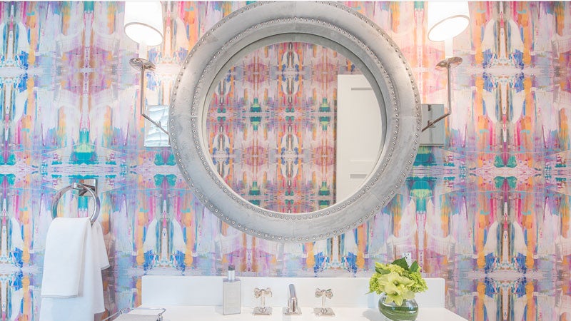 Powder Room
Artist Lindsay Cowles creates wallpapers from sections of her original paintings—they are always abstract, bright and bold. “I use her papers as often as my clients will let me,” Lisa says. “Bathrooms are so hard to get personality in at times, and with her papers they immediately turn into works of art!” Lisa loves the color of Lindsay’s No. 810 Pink they picked. ”It’s just cool,” she says. To contrast the paper’s boldness, Lisa and Heather selected a solid vanity from Fixtures & Finishes, and a grey velvet mirror hangs above it.
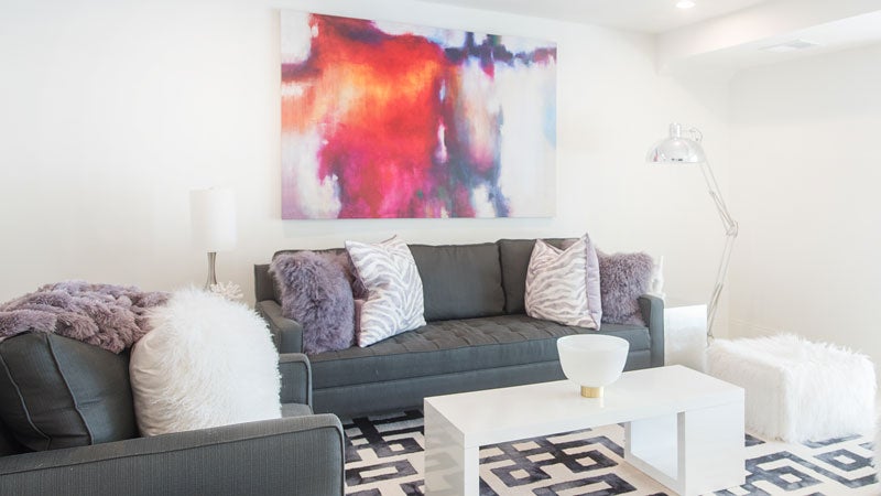
Basement
Pops of purple, bright art and a geometric rug fun up this teen hangout space, which has plenty of extra seating that can be moved around. Oyster-colored pavers by Firerock are both durable and easy to clean, making a suitable surface for storage closets that surround the living area. The Clays also plan to add a game room with a pool table in a room behind this space.
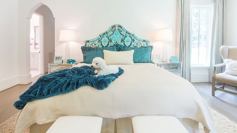 Master Bedroom
The turquoise headboard came from the Clays’ previous house, so Heather picked neutrals for the floor-to-ceiling curtains with a silver and gold sheen and other parts of the room, enabling her to easily swap out only some elements to give the room a different feel one day.
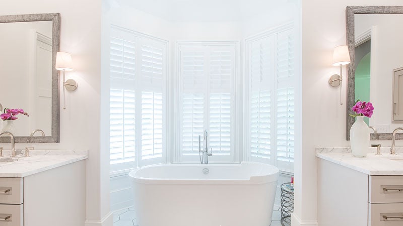 Master Bathroom
The custom mirrors from Village Framers in each bathroom feature a different metallic texture that varies in shape and thickness. All the bathrooms have similar dual lamps but with slightly different shapes and different hues on their shades. Here in the master, these elements mix in a darker hue with the lighter marble countertops and shower as well as the floor tile, a crushed porcelain tile with touches of grey.
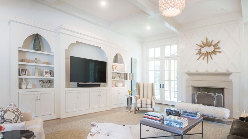 Living Room
The signature elements of this room are the crisscross wood pattern above the fireplace and the coffered ceiling. A sunburst with clouds from Antiquities in Mountain Brook Village hangs above the mantle. Gas fireballs provide heat in a sleek design within the limestone fireplace that is wood-burning on its screened-in porch side. Adjacent to it, a built-in bookshelf offers decorative space with cabinets with Lucite handles on the lower storage space.
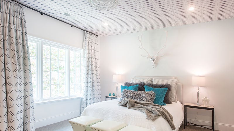 Teenager Bedroom
Like the dining room, Akimbo Greyscale wallpaper by Eskayel makes a statement for Hollis’s room. She wanted blacks, whites and greys for her space, so she and Lisa worked to incorporate them in her headboard, bedding and curtains while adding a pop of turquoise in pillows.
Behind the Scenes
- Residential Designer: Eric Dale
- Builder: Paul Davis, Ruff Reams Building Co.
- Interior Design: Lisa Flake, Caldwell Flake Interiors
- Cabinetry: Bud’s Cabinets
- Cabinet Hardware, Front Door Pull: Brandino Brass
- Fabricator: Will Casey, Synergy Stone
- Plumbing Fixtures: Fixtures & Finishes
- Outdoor Lighting: Architectural Heritage
- Stone & Tile: Synergy Stone, Triton Stone Group
- Indoor Lighting & Carpet: Hiltz-Lauber
- Front Door & Shutter Stain: Daniel Whitsett, Paintworks Design Studio
- Kitchen Appliances: Thermador
- Select Rugs: King’s House Oriental Rugs, Paige Albright Orientals

