There was no doubt that the home on Overton Road was a diamond in the rough—emphasis on the rough— when it caught Wellon Bridgers and Ashley Brigham’s eyes.
It was a head scratcher—what could it be? To both of them it was like a stubborn child. “We had to study it to learn what it wanted to be,” Ashley says.
Built in 1950, it had many characteristics of a rancher, but its lines and inches-thick concrete walls and ceilings weren’t standard in 1950s homes. In the end, Ashley and Wellon decided to channel a California-meets-Mediterranean feel for the design of its renovation with emphasis on its outdoor terraces and new curves on staircases, archways and more.
What wouldn’t be changed about the home was its position perched atop a ridge overlooking Overton Road, with views of the sunrise on one side and sunset on the other. As you round the curve, stately homes sit far back along the road, and Wellon and Ashley wanted to restore this sprawling house to its true nature in keeping with the street it had called home for nearly seven decades.
After all that’s just what the two friends with a shared passion for design like to do as Ndéké (Congolese for “nest”) Homes. “The idea came to us of taking something that was really forgotten and bringing it back to life as a nest for someone else,” Ashley says of when they first got started. In fact in the first home they renovated together in the Hollywood area of Homewood they found a bird’s nest when they first entered that they now display in a cloche in every house they work on.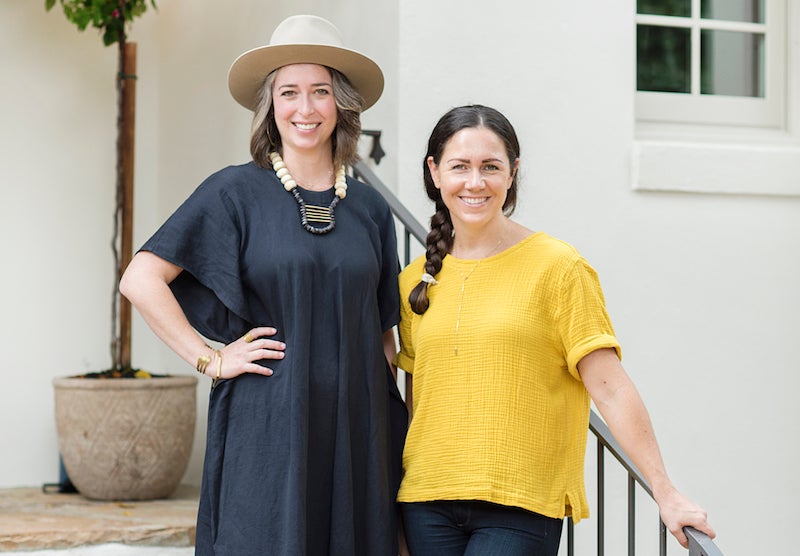
With professional skill sets in art (Wellon) and real estate (Ashley), the duo enjoys collaborating on both big picture design vision and picking out unexpected light fixtures—what Wellon calls “the jewelry of the house.”
To start with they knocked down walls off the living room to open it up to the kitchen and vaulted the ceiling. In the bedrooms, they reworked bathrooms and closets, creating nooks with shelves anywhere they saw fit. Downstairs, they finished off what was originally a two-car garage to add a fourth bedroom and extra living space, and then created a terrace in front to marry it with the rest of the exterior design.
Wellon likens her artwork that was displayed throughout the home when they staged it—with both landscapes with an ethereal feel and contemporary pieces with abstract elements—to the house’s final design that has a simultaneous antique feel and contemporary California vibes. “It’s unassuming but still in a stately way,” she says.
In the end, its soft white feminine curves and industrial elements combine to create a serene feel for anyone who walks in. And her name? The Swan House, drawing both from her conversion from an “ugly duckling” and the swan figurine andirons in the fireplace that were the only object that remained from the previous owners and now have been cleaned and will be left for its future owners.
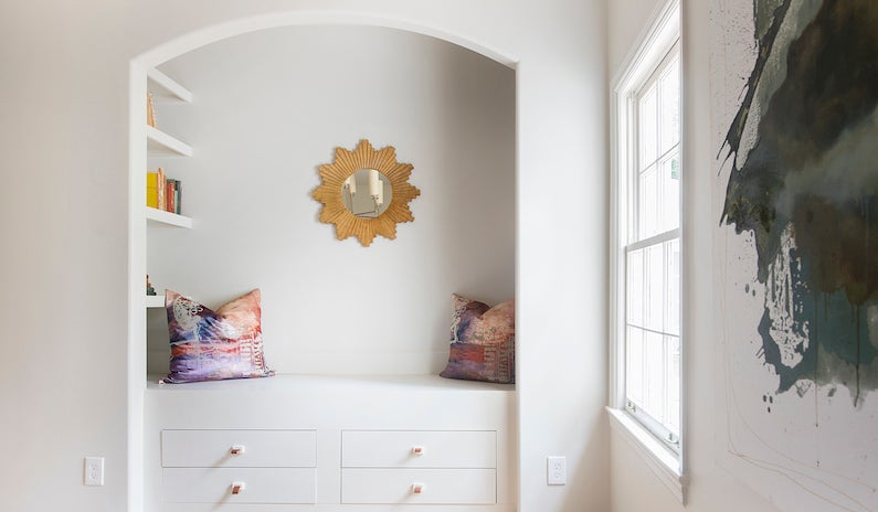
Master Reading Nook (pictured at top)
What were originally two small closets are now a reading nook in the master bedroom. Bookshelves are built into the right side of it and leather pulls add flair to the drawers. The arch at its top echoes other design elements in the house too.
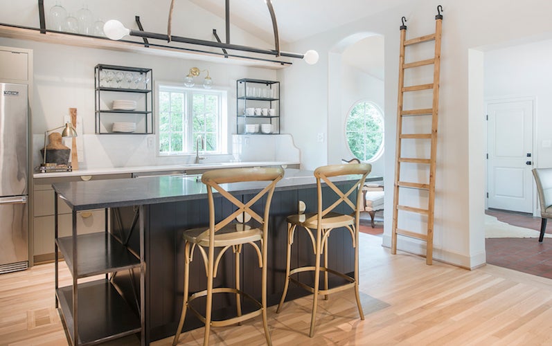 Kitchen
Custom iron work adds dark, industrial detail to the light walls in this open entertaining space. Wellon and Ashley designed the iron light above the island with inspiration from another light fixture they had seen, and iron brackets line the shelf at the top of the vaulted ceiling as well as hooks on the ladder that can be used to access it. There are also iron shelves above the cabinets and on the cap of the dark leathered granite island. These dark elements contrast with the Desert Grey modern beadboard cabinets with brass pulls, and Bianca white marble on the back counter flows up to the curved backsplash as well.
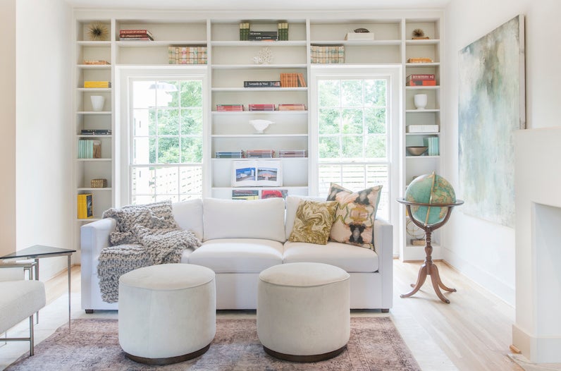 Living Room
In this room that now opens to the kitchen and sunroom, Wellon and Ashley reworked the original floor-to-ceiling bookshelves and built a new stucco-feeling mantle around the existing marble fireplace.
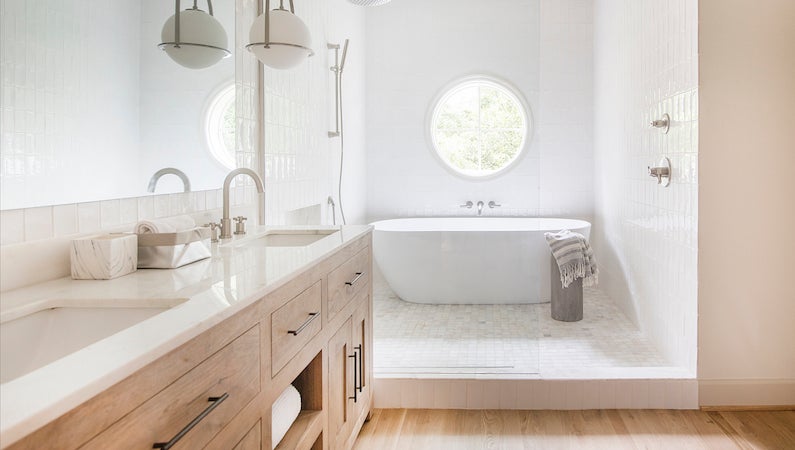 Master Bathroom
Wellon and Ashley had this bathroom taken down to its studs to rework and expand it and the master closet with borrowed space from the closets in another bedroom too. The spacious shower showcases both a circular window and a bathtub, and a white wall of vertical tile contrasts with the hardwoods and vanity.
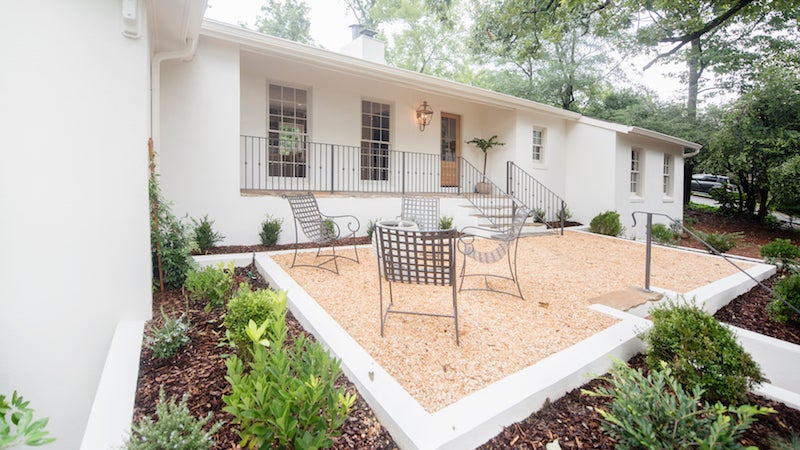 Front Terrace
The California vibes of this outdoor space as you enter the home set the tone for the design inside.
Behind the Scenes
- Design & Floorplan: Ndéké Homes
- Artwork: Wellon Bridgers
- Select Staging: Spiffy Staging & Design
- Iron Light and Hanging Shelf: Jeremy Roegner
- Iron Shelving Units: Toro-Cordes Iron Arts

